
Most monthly SEO reports are a highlight reel. Rankings up, traffic up, a few new links, a tidy chart with a green arrow. Then a month comes along where the numbers are flat, or an older page starts quietly bleeding clicks, and the whole thing falls apart. A report built only to celebrate has nothing to say when there’s nothing to celebrate.
That’s the month that actually matters. It’s the one where a founder or a client leans in and asks what they’re paying for.
Here’s a number worth keeping in mind before you build your next report: when HubSpot refreshed old, decaying posts instead of writing new ones, it lifted their monthly organic views on those posts by an average of 106%. The traffic wasn’t hiding in new content. It was sitting in pages they’d already published and stopped looking at.
Good SEO monthly reporting catches that. Let’s get into what belongs in the report, what to cut, and the one section almost nobody includes.
What a monthly SEO report is actually for
Strip away the templates and an SEO report is one thing: a monthly snapshot that explains what changed, why it changed, and what you’re doing about it next. That’s it. Not a data dump. A story with numbers attached.
It helps to separate two things people mix up. An SEO dashboard is live. You check it whenever you want, and it shows real-time data for your own monitoring. A report is a fixed snapshot you hand to someone at a set interval, usually monthly, that summarizes a period and tells them what it means. The dashboard is for you. The report is for them.
A monthly report has three jobs. It proves the work is paying off. It catches problems while they’re still small. And it decides what next month’s work should be. Miss any one of those and you’ve got a pretty PDF that nobody reads twice.
The trap most client SEO reporting falls into? It only knows how to talk about wins. So the moment growth stalls — and it always does, eventually — the report goes quiet or defensive. And a quiet report during a slow month is exactly how a client starts wondering whether they still need you.
The core metrics every monthly report needs
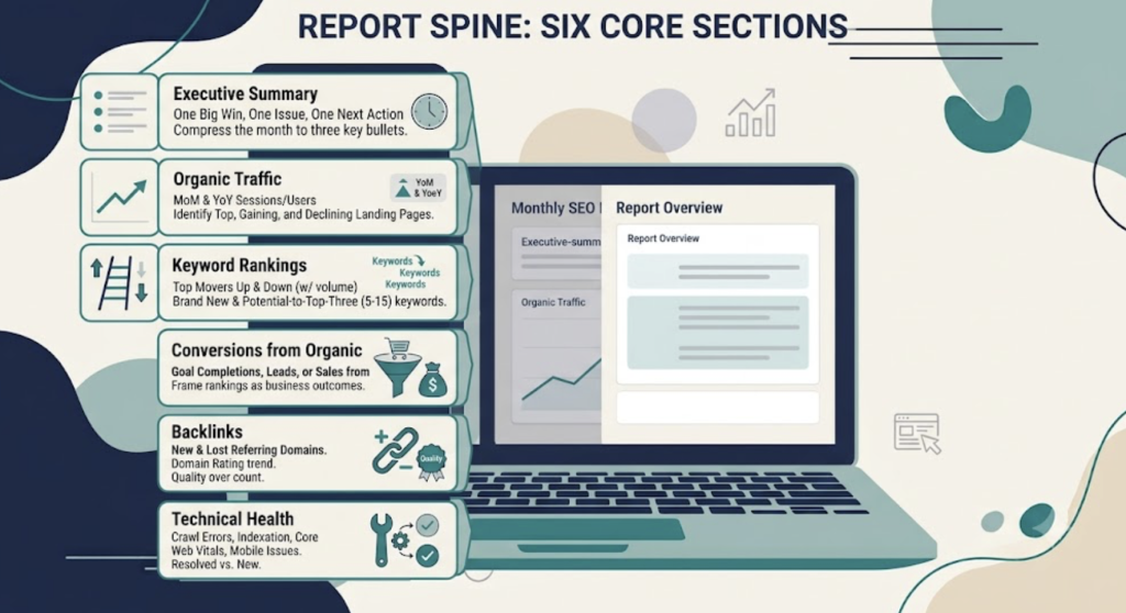
Before the clever stuff, you need a spine. These are the sections a stakeholder expects to see, and leaving them out reads as sloppy, not innovative. Keep each one tight.
Executive summary
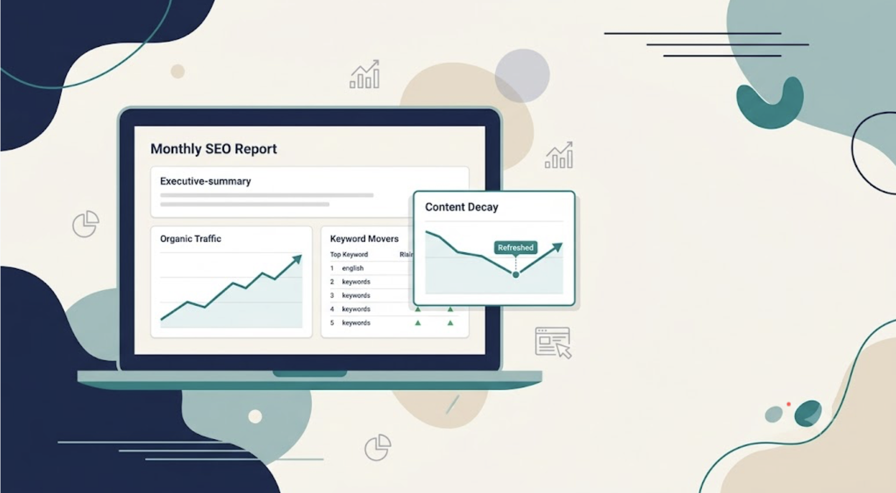
Put this first and make it readable in two minutes by someone who doesn’t know what a canonical tag is. Three things: the single biggest win of the month, the one issue that needs attention, and the one action you’re taking next. If you can’t compress the month into three bullets, you don’t understand the month yet.
Organic traffic
Pull organic sessions and users, and show both month-over-month and year-over-year. Honestly, your organic traffic report matters most as a year-over-year comparison. A 20% dip in January means nothing if this client’s peak is always Q4. Include your top organic landing pages, and flag the biggest gainers and the biggest decliners. Hold that thought on decliners.
Keyword rankings
Your keyword ranking report should tell a story, not list four hundred rows. Break it into movers up (with previous position, current position, and search volume), movers down (with a likely cause next to each), brand-new keywords cracking the top 100, and the quiet moneymakers: terms sitting in positions 5 to 15 that could reach the top three with a nudge.
Conversions from organic
Traffic is a means, not the point. Show goal completions, leads, or sales that came from organic search specifically. This is the number that survives contact with a CFO. When you frame a ranking jump against its estimated click-through change, a metric turns into a business outcome — “position 9 to 4” becomes “roughly this many more visitors a month.”
Backlinks
Report new and lost referring domains and the domain rating trend. Quality over count, always. One editorial link from a real publication beats five hundred directory submissions, and reporting the raw number just invites the wrong questions.
Technical health
Crawl errors, indexation changes, Core Web Vitals, mobile issues. Show what you resolved this month against what’s newly broken. A before-and-after here is worth more than a static snapshot — it proves motion.
Those six are your seo kpis. Master them and you’ve got a report that’s competent. But competent isn’t the same as convincing, and there’s a gap in nearly every report I see.
The metric almost every report is missing: content decay
Go read the top-ranking guides on monthly reporting. They’ll all mention “pages with the largest declines” somewhere near the traffic section. A single line. Then they move on.
That’s the miss. Content decay isn’t a footnote in the traffic section. It’s its own line item, and it might be the most important one in the whole report.
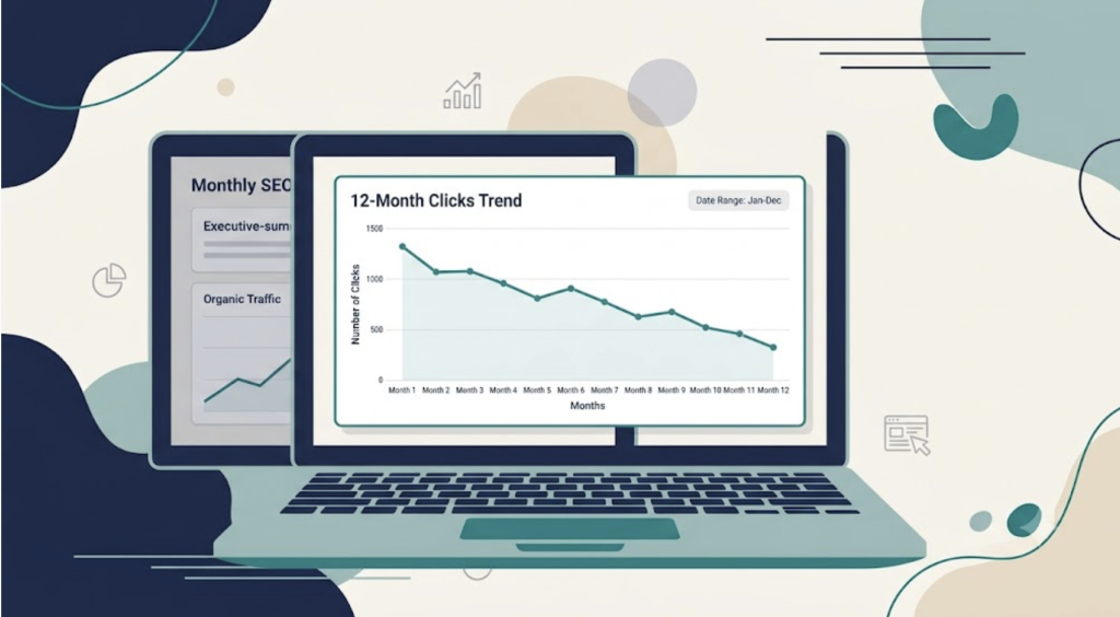
So what is it? Content decay is the slow loss of rankings and traffic on a page that already proved it could rank. Not a penalty. Not a sudden crash from an algorithm update. Just a gradual slide (usually somewhere between 10% and 30% traffic loss) as your information ages, search intent shifts, and competitors publish something fresher. If you want the deeper version, we broke down how to find and fix it separately.
Here’s why it’s dangerous. Your oldest pages are usually your most authoritative ones. They’ve collected the backlinks. They carry the ranking history. So a quiet decline on those URLs drains a big share of your whole site’s performance without ever setting off an alarm. Nobody notices, because nobody’s looking at the pages that used to be fine.
And it’s sneaky in the data. Rankings can hold steady while clicks fall. That’s usually lost SERP real estate or a click-through decline, not a position problem, and it means you won’t catch decay by watching rankings alone.
How do you surface it for the report?
Pull 12 to 14 months of Google Search Console data and sort your declining URLs by absolute click loss, biggest drops first. That puts your highest-value bleeders at the top, which is exactly where your attention should go.
One caution before you sound the alarm. If Search Console clicks are stable but GA4 sessions dropped, that’s almost always a tracking problem, not real decay. Think a consent banner, a broken tag, a changed channel definition. Check that before you put “traffic down” in front of a client. Manually watching this across hundreds of URLs is brutal, which is the whole reason a tool like WordPattern exists. It watches Search Console for patterns of decline so a two-spot-a-week slide doesn’t become a crisis you find out about in Q3.
How to report refresh impact (the most defensible number you can show)
Reporting decay is only half the move. The other half — the part that makes a stakeholder actually trust the report — is showing what happened after you fixed it.
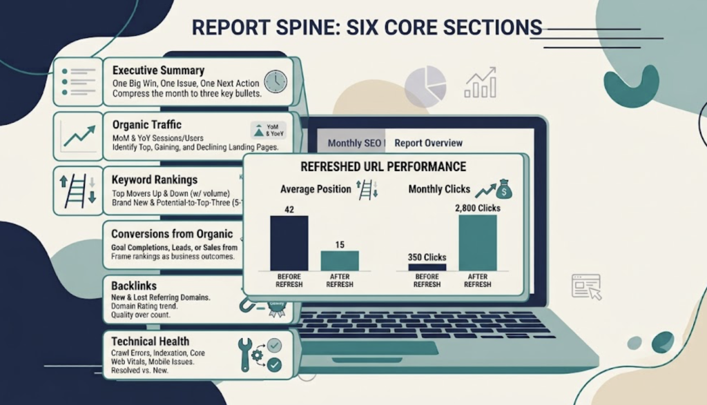
Refresh impact might be the most credible number in the entire document. Here’s why. It’s a clean before and after on a single URL, with a date attached. Nowhere to hide, nothing to fudge.
The format is simple. For each page you refreshed, show the position before and after, the clicks before and after, and the date you pushed the update. A three-row table does it. No narrative gymnastics required — the numbers carry it.
Why does refreshing beat writing something new? Because the URL already earned its keep. It has age, authority, and links, so a refresh can re-index and start climbing in two to four weeks, while a brand-new page often needs three to six months to do anything at all. You’re not starting from zero. You’re reviving something already partway up the mountain.
One catch: depth matters. Swapping a date in the title and calling it refreshed does nothing. The real results come from structural rewrites. HubSpot’s refreshed posts averaged that 106% lift in organic views and more than doubled the leads those pages generated. And a Portent analysis of 60 posts found full rewrites averaged 454% keyword growth versus almost nothing for cosmetic edits. So the takeaway isn’t “update old posts.” It’s “actually rewrite them.” (If you want quick candidates to start with, here are six low-effort refreshes that tend to pay off fast.)
Put decay and refresh together and you’ve changed what a down arrow means. Instead of “your traffic dropped, here’s my excuse,” you get this: here’s the page we caught slipping, here’s what we rebuilt, here’s the lift. That’s not an apology. That’s a workstream, and it’s the kind of thing WordPattern’s refresh logic is built to generate drafts for, entity gaps and all.
A filled-in monthly report example
Every SEO report template you’ll find online is a skeleton of [bracketed placeholders]. Useless when you’re staring at a blank page. So here’s a filled-in monthly seo report example for a made-up B2B SaaS blog. Numbers are illustrative, but the shape is real, so copy it.
Executive summary — March
- Win: “project management templates” moved from position 8 to 3; organic sessions to that page up 61%.
- Watch: three cornerstone posts from 2023 lost a combined 2,400 clicks over the last two quarters. Decay, not a glitch — confirmed against GA4.
- Next: refresh the top two decaying posts by mid-April.
Top ranking movers
| Keyword | Was | Now | Volume |
|---|---|---|---|
| project management templates | 8 | 3 | 6,600 |
| sprint planning guide | 14 | 9 | 2,900 |
| team capacity planning | — | 22 | 1,300 |
Decay watch
| Page | 12-mo click trend | Absolute loss | Likely cause |
|---|---|---|---|
| /remote-team-tools | down 34% | 1,500 clicks | outdated tool list, newer competitor pages |
| /okr-examples | down 19% | 900 clicks | intent shifted toward templates |
Refresh impact (from last month’s work)
| Page | Position before → after | Clicks before → after | Refreshed |
|---|---|---|---|
| /agile-metrics | 11 → 6 | 320 → 740 | Feb 18 |
See how the decay and refresh rows just sit alongside the classic tables? Nobody had to reformat their brain. The report still opens with wins. It just stopped pretending the aging pages don’t exist.
What to leave out
A focused eight-page report beats a twenty-five-page data dump every single time. The skill is subtraction.
Cut the vanity metrics. Raw impressions with no click-through context, total indexed pages, Domain Authority dressed up as a Google signal, social follower counts, keyword difficulty scores floating with no recommendation. They add volume and zero signal. They make the report look busy and feel empty.
Cut uncontextualized competitor data too. “Competitor X gets 40,000 visits” means nothing on its own. What does it mean for this client, this month, this decision? If you can’t answer that, it doesn’t go in.
The rule is almost embarrassingly simple. If a metric has no action attached to it, leave it out. A report is a decision tool, not a trophy case.
Newer layers worth adding: AI visibility
Worth a short section, not a starring role. Whether your pages get cited in ChatGPT, Gemini, and AI Overviews is becoming a real reporting layer alongside classic rankings.
Track it lightly for now: how often you’re mentioned, your rough share of voice against competitors, which queries surface you versus them. It’s useful signal, and it’s early enough that showing up with it makes you look sharp.
Just keep it in proportion. Most stakeholders still care about traffic and leads first, second, and third. AI visibility is a promising fourth, not a headline.
How to present the report so it lands
A report is only as good as the conversation it starts. Same numbers, different framing, completely different reaction.
Frame every win with specifics and a business outcome. “Rankings improved” is forgettable. “Your main service keyword went from position 9 to 4, which sharply lifts the click-through rate at that spot” is a sentence someone repeats to their boss.
Never let a drop sit there unexplained. Name the reason: an algorithm update, a competitor’s new page, seasonality, or a decay pattern you already caught. Even “we’re still diagnosing this and I’ll have an answer next month” beats silence. Unexplained drops erode trust faster than the drop itself ever could.
Show a six-month trend next to the monthly numbers. SEO moves slowly, and a single month can look scary out of context. The longer line usually tells a calmer, truer story.
And when you present live, keep it to twenty or thirty minutes. Executive summary, the two or three biggest moves, the decay-and-refresh story, next month’s plan. Leave the full data in the doc for them to read on their own time.
The shift worth making
The habit to break is reporting only what grew. Growth is the easy part to talk about. What separates a report that survives a flat month from one that doesn’t is whether it can talk honestly about what’s slipping, and show that you’re already on it.
That’s the whole case for adding a decay watch and a refresh-impact row. They turn your worst month into your most convincing one, because they prove you’re managing the whole asset, not just cherry-picking the good news.
Start small. Next month, add one decaying page to your report and one refreshed page with its before-and-after. Just those two rows. You’ll feel the room change.
FAQs
Monthly is the sweet spot. SEO moves too slowly for weekly reports to show anything but noise, and quarterly leaves problems festering too long. A monthly cadence is long enough to reveal a real trend and short enough to catch decay before it does serious damage.
A dashboard is live and always-on — you check it yourself to monitor performance in real time. A report is a fixed snapshot you send to a stakeholder at a set interval, with narrative and context added. The dashboard answers “what’s happening right now?” The report answers “what happened, and what does it mean?”
Organic conversions and organic traffic trends, in that order. A founder cares about leads and revenue far more than about position 4 versus 6. Translate every ranking or technical win into its effect on traffic and conversions, and lead the report with the outcome, not the mechanism.
Attach a cause and a plan to it. A drop with an explanation (“this competitor published a stronger page; we’re refreshing ours by the 15th”) reads as control. A drop with silence reads as a problem you didn’t see coming. If some of the drop is content decay, say so plainly and show the refresh you’re queuing to reverse it.
Look for a consistent downward trend over several months, not a single dip. Confirm it in Search Console rather than analytics alone, since tracking changes can fake a drop. If clicks are sliding month after month on a page that used to be stable, especially one older than two years, that’s decay, and it’s time to refresh.